ByeWind Dashboard Replication
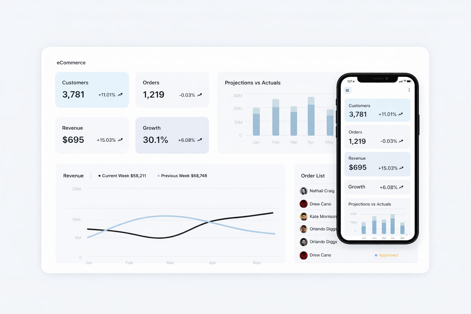
A high-fidelity replication of the ByeWind design of Snow UI. This project focuses on pixel-perfect frontend execution, featuring a comprehensive main dashboard and a detailed e-commerce order list page. Developed as a technical assignment for a Frontend Engineer role, it showcases the ability to translate complex design systems into functional, responsive, and performant web interfaces.
Project Brief
1. Objective
The objective was to implement the provided SaaS dashboard designs in React with pixel-perfect accuracy, ensuring meaningful motion and microinteractions were added to enhance the user experience.
2. Design Files
The implementation is based on Figma design files provided via a Dev Handoff Page. All screens and design components were thoroughly reviewed before development commenced.
3. Technical Requirements
- The project required the use of React with modern JavaScript (ES6+) and CSS3. While UI libraries were permitted, the final output aligns strictly with the provided designs.
- Best practices for code quality were followed, focusing on proper structuring, modularity, readability, and documentation.
- Ensuring the implementation works correctly across major browsers (Chrome, Firefox, Safari, Edge) was a key requirement.
4. Deliverables
- A public GitHub repository containing the source code.
- A
README.mdfile with clear setup instructions and a section describing design decisions, challenges faced, and improvements made. - A deployed application on a hosting platform like Vercel, with a live demo link provided.
5. Timeline
The project was completed within a 4-day timeframe from the assignment date.
6. Important Notes
- The code is original and written from scratch to ensure authenticity.
- External libraries were utilized where they aligned with project requirements and enhanced development efficiency.
Evaluation Standards
1. Pixel-Perfect Implementation
- The implementation matches the Figma designs exactly, including layout, spacing, typography, colors, and alignment.
- All UI components (buttons, inputs, modals, etc.) are consistent with design specifications.
- Typography, font sizes, weights, and colors are used correctly as per the design system.
- The final version is fully responsive across desktop, tablet, and mobile devices.
2. Code Quality and Best Practices
- The code is well-organized, easy to navigate, and follows a logical structure.
- Reusable components are used to avoid duplication and adhere to DRY (Don’t Repeat Yourself) principles.
- Code is clean, well-documented, and uses meaningful variable names.
- Accessibility standards (ARIA roles, keyboard navigation, focus states) were followed.
4. Functionality
- Implemented features include Filtering, Searching, Sorting, Pagination, and Dark/Light theme toggle.
5. Documentation and Deployment
- Clear documentation is provided for code components, functions, and modules.
- Instructions for setting up and running the project locally are included.
- The application is deployed and accessible via a working demo link.
Technologies Used
- Framework & Language
- Next.js 15
- React 19
- TypeScript
- Styling & UI
- Tailwind CSS
- shadcn/ui
- Lucide React (Icons)
- Data & Tables
- TanStack Table (React Table)
- Recharts (Data Visualization)
- date-fns
- Deployment
- Vercel
- CI/CD via GitHub Actions